Advertising can be a powerful tool for reaching potential customers, but when done poorly, it can have the opposite effect. Sometimes, a well-intentioned ad ends up being memorable for all the wrong reasons. Below are some examples of bad ads, showcasing how poor placement, design flaws, and confusing messaging can lead to unintended and often embarrassing outcomes.
1. Billboard Placement Gone Wrong: Family Values vs. Strip Club

Lesson: Always consider the placement of your ads and how nearby ads might impact your message. The wrong placement can completely undermine your campaign.
2. Misspelled Sign: Churrch

Misspellings can quickly turn a well-meaning sign into a laughingstock. In this case, a church sign that tries to be clever by asking, "What’s missing?" and leaving out the "UR" from the word "church" ends up being more confusing than clever when you leave an extra R. The attempt to engage the audience falls flat when the meaning isn't immediately clear.
Lesson: Double-check your spelling and ensure that your wordplay is easily understandable to avoid confusing or alienating your audience.
3. Poor Logo Design: When Fonts and Graphics Mislead

Designing a logo requires careful consideration of how the text and graphics work together. Unfortunately, this wine club’s logo design combines the words "Grape" and "Nuts" in a way that unintentionally highlights an inappropriate phrase. The poor design makes the brand look unprofessional and can lead to a negative perception from potential customers.
Lesson: Always review how your text and graphics interact. A simple design flaw can drastically change the meaning of your logo and lead to unintended interpretations.
4. Car Ad Cutoff: The Face Behind the Window

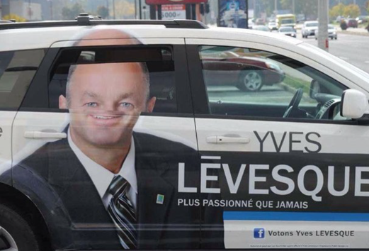
Vehicle wraps are a popular advertising tool, but they can go horribly wrong if not carefully executed. In this case, a car wrap featuring a politician’s face gets distorted when the window is rolled down, cutting off the top half of his head. Instead of promoting the candidate, this ad creates a distracting and unflattering image that detracts from the campaign.
Lesson: Consider how your design will interact with the vehicle's moving parts. Test your wrap on an actual car before committing to ensure that the final product looks professional and consistent in all scenarios.
5. Confusing Billboard: The Dog Diver

Lesson: Clarity is key in advertising. If your audience can’t immediately grasp the message, your ad is likely to be ineffective. Stick to visuals that enhance, rather than detract from, your message.
6. Photoshop Fail: The Case of the Missing Arm

In the digital age, many ads rely on photo editing software to create eye-catching visuals. However, when editing is done carelessly, the results can be disastrous. In this Fanta ad, the model’s left arm was unintentionally cut off during the editing process. The oversight not only looks unprofessional but also distracts from the product being advertised.
Lesson: Always double-check your work, especially when using editing software. Small mistakes can make a big difference in how your ad is perceived, potentially damaging your brand’s reputation.
Conclusion
Bad ads are often the result of overlooked details, poor planning, or misguided creativity. By learning from these examples, you can avoid similar pitfalls in your own advertising efforts. Remember, the key to a successful ad is clear communication, thoughtful design, and strategic placement. Don't let your campaign become the next cautionary tale!

